Manoya
At Babelfont, we don’t sell letters. No. We set them free. We sculpt them. We pamper them. We watch them walk the baseline like tightrope walkers without a net. Because a letter, you see, is like a musician in an invisible orchestra. If it plays out of tune, everything sounds hollow. But if it hits the right note, harmony slips into the reading. One day, I wrote “Bonjour” with a typeface that was too tight. The word looked rushed. It took off without saying goodbye. Since then, I choose my fonts carefully. Some typefaces shout, others whisper. Some march in step, others dance in circles. And Babelfont’s fonts? They sing in many voices in Arabic, Latin, Tifinagh, Hangul! These are polyglot alphabets, holding hands without stepping on each other’s toes. And even when they say nothing, they still speak. Because typography is the art of speaking without sound. Once, I saw the letter “a” shaped like a pear. And an “m” with legs. It was a living typeface, a real one. I asked it, “What are you doing in this word?” It answered, “Waiting for what comes next!” That’s the typographic miracle: every letter waits for its sentence, every symbol hopes for a story. At Babelfont, we craft narratives before even writing words. So yes, a good typeface is like a good phrase: you don’t explain it you print it.
마노야
처음 “바벨폰트(Babelfont)”를 들었을 때, 저는 외계 타이포그래피 비밀 조직인 줄 알았습니다. 글자가 춤을 추고, 자음이 모음을 데이트를 신청하고, 글꼴 하나가 무대에서 독백을 한다는 소문까지 있었습니다. 상상해보세요. ‘ㅁ’이 무대 중앙에서 “나의 사각은 너의 둥글음을 사랑한다!”라고 외친다면 얼마나 낭만적일까요?
바벨폰트에서는 글자가 조용히 있질 않습니다. 하나는 굵어지고, 다른 하나는 기울어지고, 또 다른 하나는 티피나그 문자와 사랑에 빠집니다. 오늘은 라틴과 아랍, 내일은 한국어와 프랑스어. 글꼴들이 국경을 넘나드는 걸 보면 여권이 필요 없는 세계가 여기에 있다는 걸 알 수 있죠.
제 컴퓨터에서는 바벨폰트가 자주 장난을 칩니다. 제가 쓴 “안녕하세요”를 “안녕히계세요”로 바꿔놓거나, “사랑”을 “사각”으로 오타처럼 만들어놓죠. 하지만 전 알아요. 이건 실수가 아니라 유쾌한 장난이라는 것을요. 맞아요, 바벨폰트는 그냥 글꼴이 아닙니다. 그것은 문화 교류의 장이며, 문자들의 연극 무대입니다.
어느 날, 한자가 힌디어와 협업하고, 다음 날엔 아마 아르메니아 문자가 디저트를 소개할지도 모릅니다. 그런 세상 속에서, 바벨폰트는 저에게 말합니다: "글자는 단순한 기호가 아니라 살아 있는 리듬이다."
มาโนยา
เมื่อฉันได้ยินคำว่า "Babelfont" เป็นครั้งแรก ฉันคิดว่ามันเป็นชื่อของเกาะที่ตัวอักษรเติบโตบนต้นไม้ และย่อหน้าโบยบินในท้องฟ้าเหมือนนกที่ลืมวิธีบิน ฉันพยายามพิมพ์ชื่อตัวเอง แต่ชื่อของฉันหนีออกจากหน้าจอ มันน่าประหลาดใจที่ตัวอักษรสามารถเป็น...ล่องหน! เมื่อมันดี คุณจะไม่เห็นมัน เมื่อมันแย่ คุณจะไม่เห็นอะไรเลย!
กับ Babelfont ทุกอย่างกลับกัน ฟอนต์ไม่ได้แค่พูด มันร้องเพลง กระโดด เต้นฟลาเมงโก แล้วจู่ๆ ก็นั่งลงอ่านปุชกิน ขนาดฟอนต์หนึ่งไปพักร้อน อีกขนาดหนึ่งตกอยู่ในภาวะซึมเศร้า และตัวหนาบ่นเสียงดังว่าไม่มีใครฟังมัน เพราะทุกคนอ่านตัวเอียง!
ฉันพยายามอธิบายสิ่งนี้ให้ช่างพิมพ์ฟัง เขาบอกว่า: "คุณอ่านจากซ้ายไปขวา แต่คุณคิดจากบนลงล่าง" นั่นทำให้ฉันรู้สึกดีขึ้น เพราะฉันเคยคิดว่าตัวอักษรเป็นเพียงรูปทรง แต่ไม่ใช่! ตัวอักษรแต่ละตัวมีจิตวิญญาณ และบางตัวก็มีหนวดแมวด้วย
ตอนนี้ฉันตื่นขึ้น ดื่มกาแฟ และฟอนต์ก็เลือกฉัน วันหนึ่งเป็น Tifinagh กับ Times Roman วันถัดไปเป็นอาหรับกับ Trakl และทั้งหมดนี้ต้องขอบคุณ Babelfont เพราะถ้าไม่มีมัน ฉันคงยังเขียนทุกอย่างด้วย Comic Sans และนั่น คุณก็รู้...ไม่ใช่ชีวิต มันคือการลงโทษ!
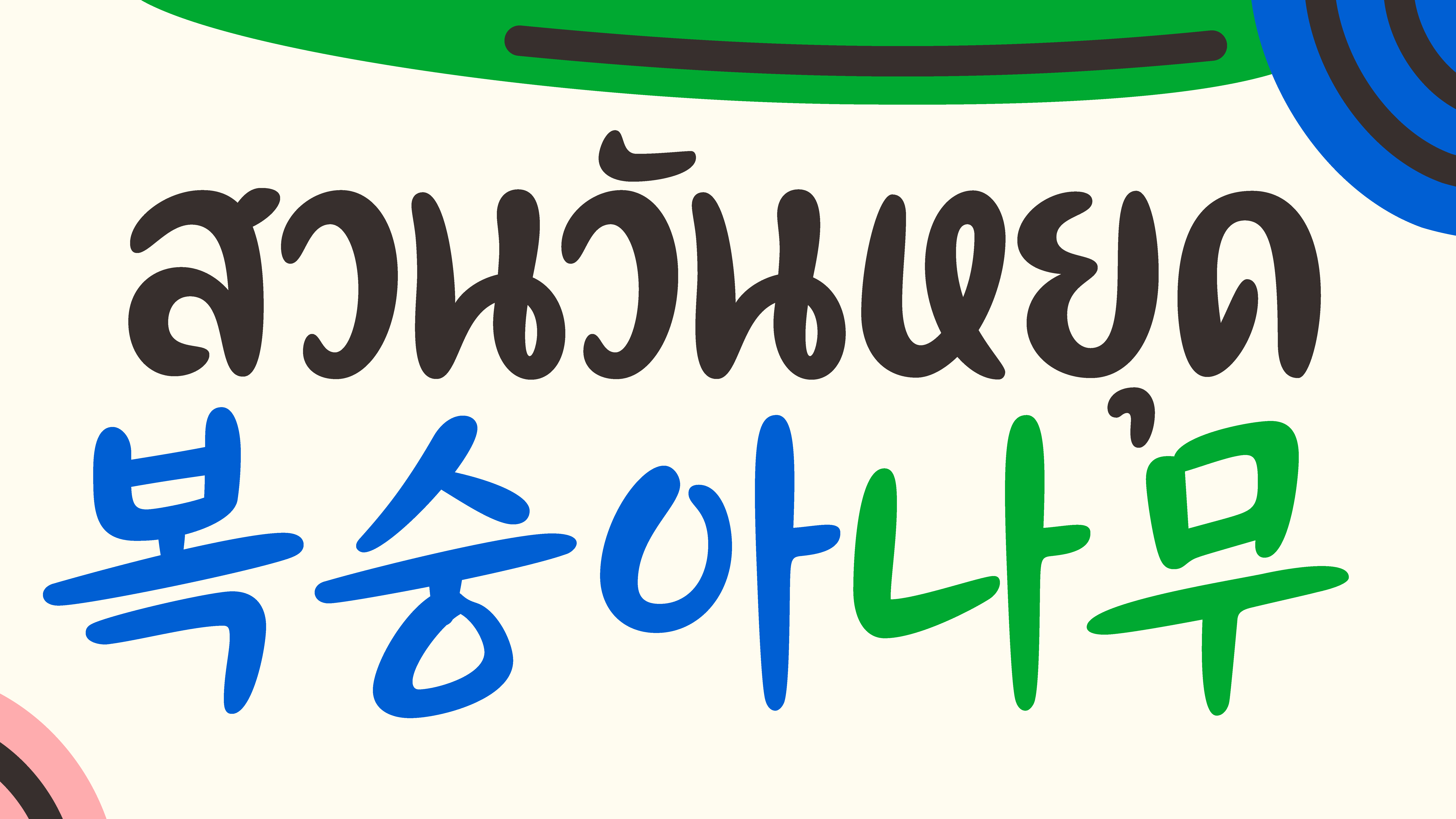
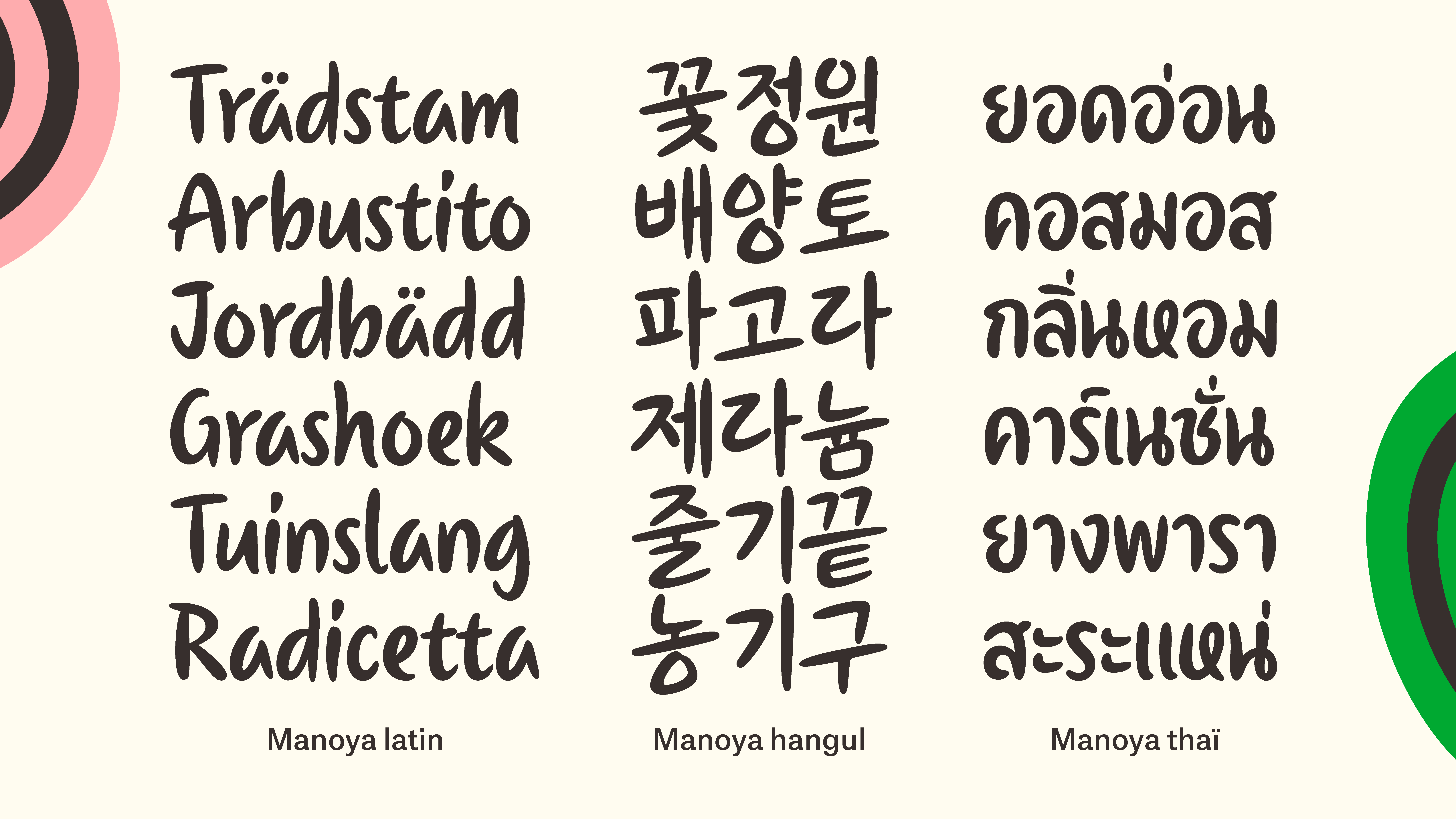
Manoya – Brushed in motion. Boldly fluid. Manoya is a handwritten display typeface drawn with a brush. It flows with energy and precision, combining spontaneity with clarity. Its single weight captures the spirit of calligraphy, echoing both Latin and Korean structures with rhythmic strokes and expressive curves. Designed for display and branding, Manoya brings a lively, human touch to every word.
Designers: Brahim Boucheikha & Gia Tran
Graphic Design: Léo Rosina
Animation: Quentin Dissard
Purchase Options
Pick your Fonts
Family Packages 0
No packages available for this font.
Single Styles 3
LATIN
HANGUL + (LATIN)
THAI + (LATIN)
Pick your Licence
Checkout
Writing System
Fonts
Licences
Subtotal
package discount
Total
0 €
Choose your Font
Choose your Licence
Add to cart