Aa
AA
120px
20px
PARAGRAPHE
   BUY
Kefrany
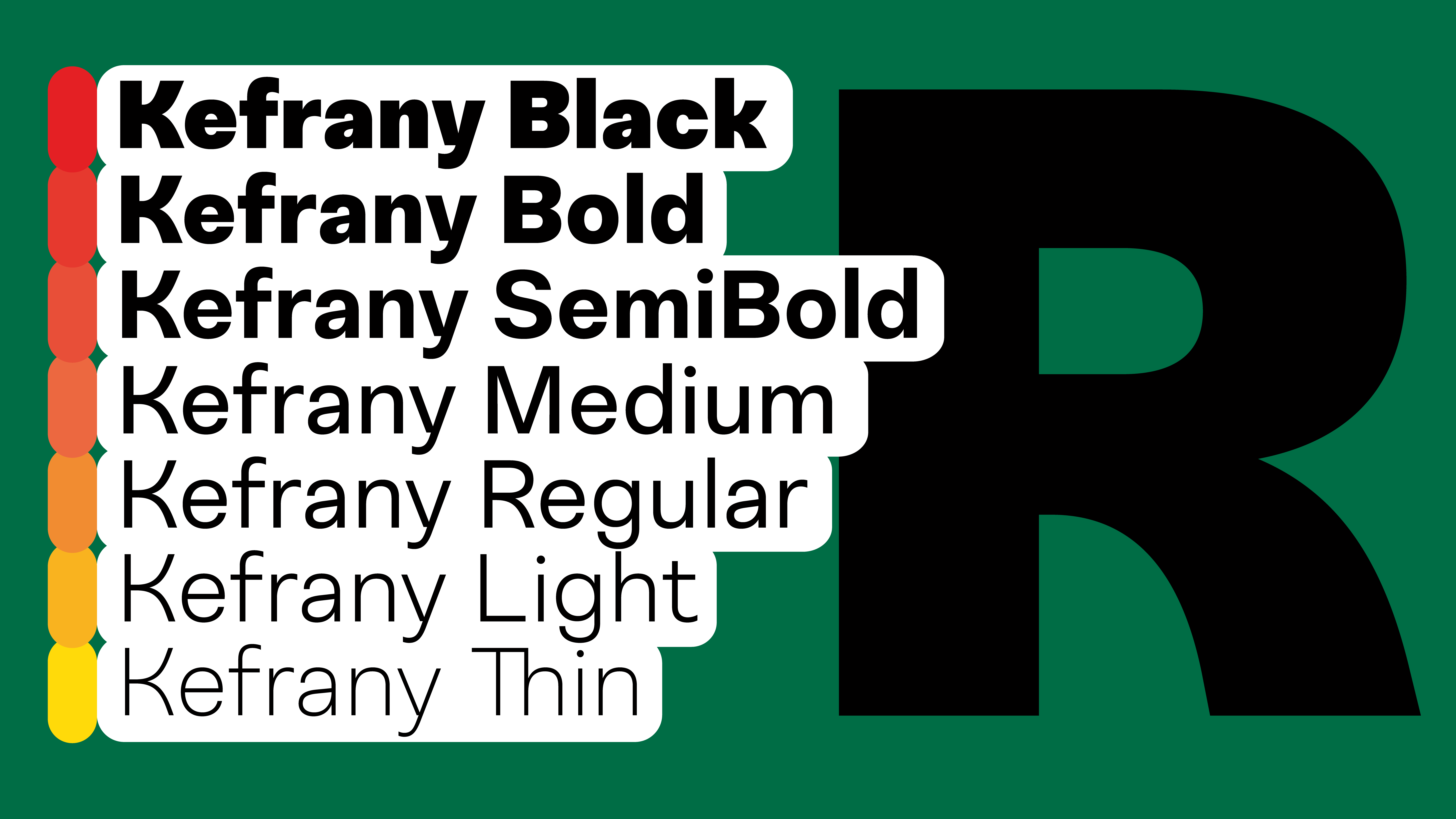
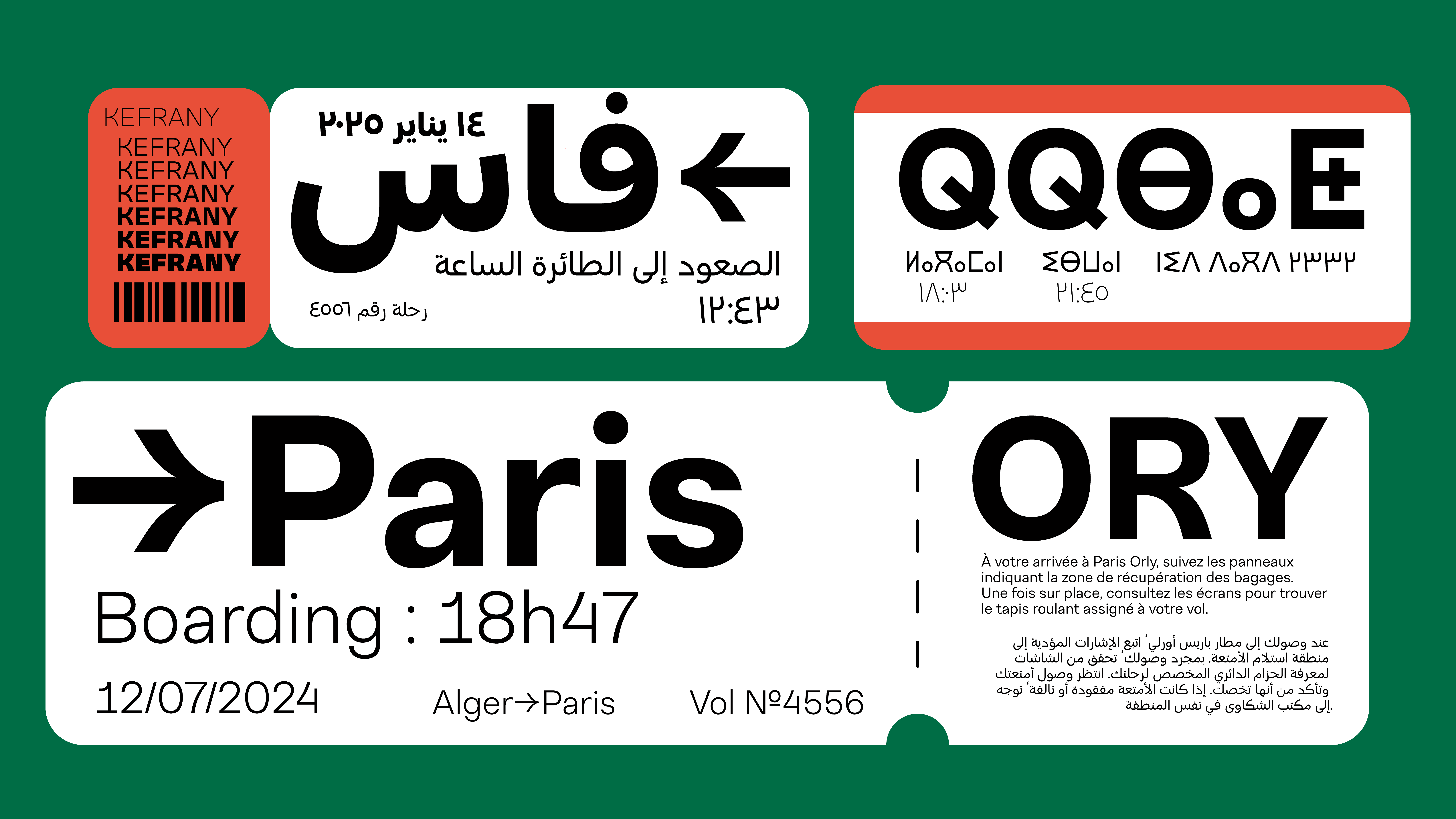
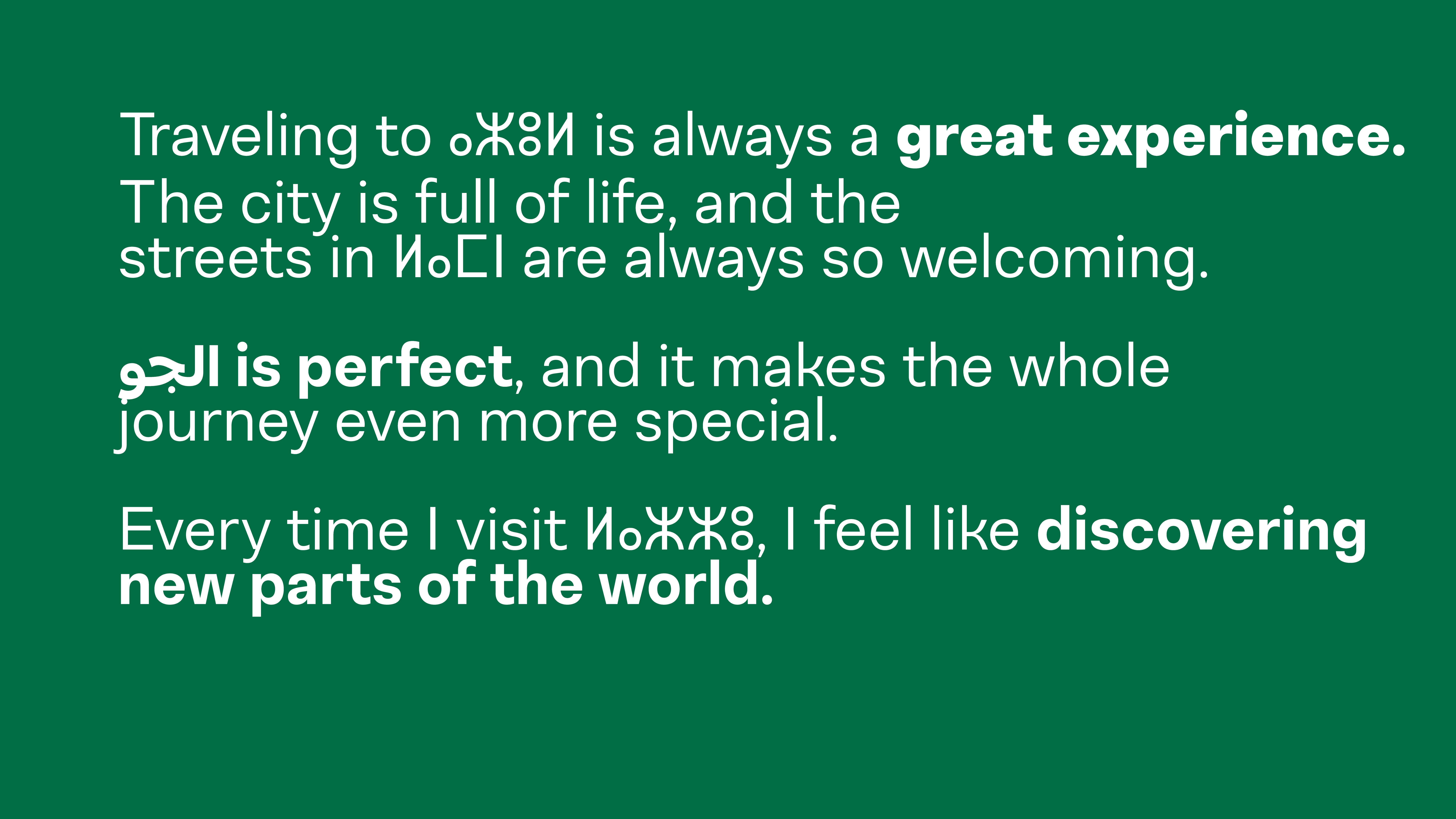
At Babelfont, we don’t sell letters. No. We set them free. We sculpt them. We pamper them. We watch them walk the baseline like tightrope walkers without a net. Because a letter, you see, is like a musician in an invisible orchestra. If it plays out of tune, everything sounds hollow. But if it hits the right note, harmony slips into the reading. One day, I wrote “Bonjour” with a typeface that was too tight. The word looked rushed. It took off without saying goodbye. Since then, I choose my fonts carefully. Some typefaces shout, others whisper. Some march in step, others dance in circles. And Babelfont’s fonts? They sing in many voices in Arabic, Latin, Tifinagh, Hangul! These are polyglot alphabets, holding hands without stepping on each other’s toes. And even when they say nothing, they still speak. Because typography is the art of speaking without sound. Once, I saw the letter “a” shaped like a pear. And an “m” with legs. It was a living typeface, a real one. I asked it, “What are you doing in this word?” It answered, “Waiting for what comes next!” That’s the typographic miracle: every letter waits for its sentence, every symbol hopes for a story. At Babelfont, we craft narratives before even writing words. So yes, a good typeface is like a good phrase: you don’t explain it you print it.
Aa
AA
120px
20px
PARAGRAPHE
   BUY
كفراني
في بابلفونت، لا نرسم الحروف... بل نُحرّرها من أقفاص اللغة! هل رأيتَ حرفًا يتمطّى؟ نحن رأيناه. وحرفًا آخر يرقص على السطر، ثم يختفي فجأة في هامش المعنى. بعض الحروف عندنا تنام في الكلمة، وبعضها الآخر لا يعرف النوم... كل ما يريده هو النطق، النطق، ثم النطق! وهناك حرف كان يصرخ: "أنا لست نقطتين فوق التاء، أنا تاج!" وحرف آخر رفض أن يكون في نهاية الجملة، لأنه يخاف من النقطة. في بابلفونت، الحروف تتحدث لغات لا تُعدّ. العربية، اللاتينية، التيفيناغ، الكورية... كلها تجلس على طاولة واحدة، تشرب الشاي، وتتناقش في قضايا الشكل والبياض والميزان البصري. قد تقول لي: "لكن الحرف لا يتكلم!" وأنا أقول لك: بل يتكلم، فقط عليك أن تقرأه جيّدًا. الخط ليس مجرد رسم، إنه تمثيل مسرحي صامت، يصرخ دون صوت. بعض الخطوط سمينة، وبعضها نحيفة، وبعضها مثل طير لا يعرف أين يضع قدميه. في بابلفونت، لا نبيع الخطوط، بل نروي بها القصص. الخط عندنا لا يُقصّ ولا يُضغط... هو يُهمَس، يُقطّر، يُسكب على الصفحة كالعطر. حرف العين قال يومًا لحرف الاّم: "أنا أعقد منك!" فردّ الاّم: "لكنني أطول!" وفي النهاية اتفقا على أن الجمال في الخط ليس في الطول أو العقد، بل في الانسجام. نحن في بابلفونت لا نبحث عن الحروف، نحن نخلقها. ثم نتركها تسير على الورق كما تشاء... فهل تجرؤ على قراءتها؟


Babelfont – Kefrany – Arabic, Latin, Tifinagh

Kefrany — Rational. Versatile. Functional.
A sans-serif typeface designed with balance and restraint, Kefrany offers 7 weights from Thin to Black, supporting Latin, Arabic, and Tifinagh scripts.
Its uniform strokes, near-monoline structure, and slightly organic proportions give it a strong yet approachable voice. With its neutral and industrial feel, Kefrany is perfect for corporate branding, signage, and digital interfaces: where clarity and confidence matter most.

Designers: Brahim Boucheikha, Gia Tran, Jean-Baptiste Pernette, Étienne Guégano

Graphic Design: Léo Rosina

Animation: Quentin Dissard


View Specimen PDF